Peter Haschke
Back to the Index
North Carolina Maps in ggplot2
Heather O’Connell at the University of Wisconsin, Madison, recently and graciously shared her slavery data with me.1 I was was playing around with this data and decided to make a few maps to get a sense of it. I have little experience with maps in R but I thought these turned out pretty nicely and were easy enough to implement. See code below:
library(ggplot2)
library(grid)
library(maps)
library(ggthemes)
library(scales)

theme_set(theme_solarized())

## Loading and merging the data


map <- map_data("county")
nc <- subset(map, region =="north carolina")

dat <- read.csv("D:/Work/RandomProjects/SlaveMap/data.csv")

mapdata <- merge(nc, dat, by = "subregion")

## basic ggplotting


S <- ggplot(data=mapdata) +
  geom_polygon(aes(x=long, y=lat, group = group, fill = pslave)) +
  scale_fill_gradient2(high="#b58900", low="#eee8d5", "% Slave in 1860", labels = percent) +
  theme(axis.text = element_blank(), axis.ticks = element_blank(), axis.title = element_blank(),
    panel.grid = element_blank(), legend.position=c(.2,.15)) +
  guides(fill = guide_colorbar(barwidth=13, title.position = "top", direction = "horizontal"))

I <-ggplot(data=mapdata) +
  geom_polygon(aes(x=long, y=lat, group = group, fill = income.m)) +
  theme(axis.text = element_blank(), axis.ticks = element_blank(), axis.title = element_blank(),
    panel.grid = element_blank(), legend.position=c(.2,.15)) +
  guides(fill = guide_colorbar(barwidth=13, title.position = "top", direction = "horizontal")) +
  scale_fill_gradient2(high="#2aa198", low="#eee8d5", "Median Household Income in 2010",
    labels = dollar)

R <-ggplot(data=mapdata) +
  geom_polygon(aes(x=long, y=lat, group = group, fill = rep)) +
  theme(axis.text = element_blank(), axis.ticks = element_blank(),
    axis.title = element_blank(), panel.grid = element_blank(), legend.position=c(.2,.15)) +
  guides(fill = guide_colorbar(barwidth=13, title.position = "top", direction = "horizontal")) +
  scale_fill_gradient2(midpoint = 0.5, mid="#eee8d5", high="#dc322f", low="#268bd2",
    "% Voting Republican in 2012", labels = percent)


source("http://peterhaschke.com/Code/multiplot.R")

multiplot(S, I, R)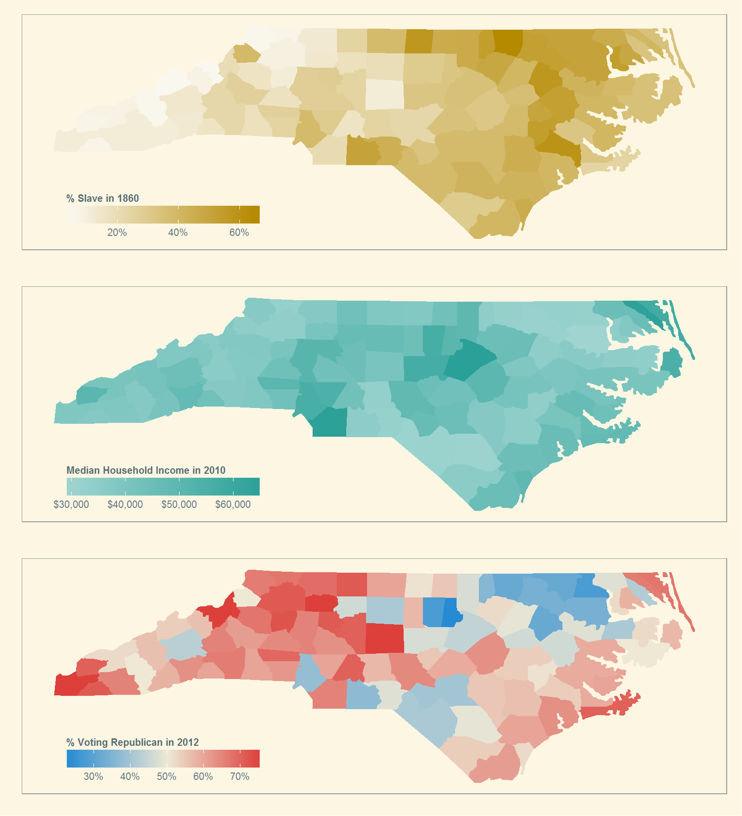
-
You may want to check out O’Connell (2012). It is an excellent paper which can be found here: http://sf.oxfordjournals.org/content/early/2012/03/26/sf.sor021.full. ↩
Back to the Blog-Index