Peter Haschke
Back to the Index
Correlation Matrix Plot
I was creating some correlation tables for the dissertation and realized that plots are vastly more intuitive. Below is an example of how to create a correlation matrix using ggplot2.
## The Data (Motor Trend Car Road Tests)


data(mtcars)

dat <- with(mtcars, data.frame(mpg, cyl, disp, hp, wt, gear))
summary(dat)
## mpg cyl disp hp
## Min. :10.4 Min. :4.00 Min. : 71.1 Min. : 52.0
## 1st Qu.:15.4 1st Qu.:4.00 1st Qu.:120.8 1st Qu.: 96.5
## Median :19.2 Median :6.00 Median :196.3 Median :123.0
## Mean :20.1 Mean :6.19 Mean :230.7 Mean :146.7
## 3rd Qu.:22.8 3rd Qu.:8.00 3rd Qu.:326.0 3rd Qu.:180.0
## Max. :33.9 Max. :8.00 Max. :472.0 Max. :335.0
## wt gear
## Min. :1.51 Min. :3.00
## 1st Qu.:2.58 1st Qu.:3.00
## Median :3.33 Median :4.00
## Mean :3.22 Mean :3.69
## 3rd Qu.:3.61 3rd Qu.:4.00
## Max. :5.42 Max. :5.00## Computing the correlation matrix
cor.matrix <- round(cor(dat, use = "pairwise.complete.obs", method = "spearman"), digits = 2)
cor.matrix## mpg cyl disp hp wt gear
## mpg 1.00 -0.91 -0.91 -0.89 -0.89 0.54
## cyl -0.91 1.00 0.93 0.90 0.86 -0.56
## disp -0.91 0.93 1.00 0.85 0.90 -0.59
## hp -0.89 0.90 0.85 1.00 0.77 -0.33
## wt -0.89 0.86 0.90 0.77 1.00 -0.68
## gear 0.54 -0.56 -0.59 -0.33 -0.68 1.00## Setting duplicates to NA and taking the absolute value
cor.matrix[2,1] <- NA
cor.matrix[3,1:2] <- NA
cor.matrix[4,1:3] <- NA
cor.matrix[5,1:4] <- NA
cor.matrix[6,1:5] <- NA
cor.matrix <- abs(cor.matrix)
cor.matrix## mpg cyl disp hp wt gear
## mpg 1 0.91 0.91 0.89 0.89 0.54
## cyl NA 1.00 0.93 0.90 0.86 0.56
## disp NA NA 1.00 0.85 0.90 0.59
## hp NA NA NA 1.00 0.77 0.33
## wt NA NA NA NA 1.00 0.68
## gear NA NA NA NA NA 1.00## Turning it all into a dataframe and removing duplicates
library(reshape)
cor.dat <- melt(cor.matrix)
cor.dat <- cor.dat[-which(is.na(cor.dat[, 3])),]
cor.dat <- data.frame(cor.dat)
cor.dat## X1 X2 value
## 1 mpg mpg 1.00
## 7 mpg cyl 0.91
## 8 cyl cyl 1.00
## 13 mpg disp 0.91
## 14 cyl disp 0.93
## 15 disp disp 1.00
## 19 mpg hp 0.89
## 20 cyl hp 0.90
## 21 disp hp 0.85
## 22 hp hp 1.00
## 25 mpg wt 0.89
## 26 cyl wt 0.86
## 27 disp wt 0.90
## 28 hp wt 0.77
## 29 wt wt 1.00
## 31 mpg gear 0.54
## 32 cyl gear 0.56
## 33 disp gear 0.59
## 34 hp gear 0.33
## 35 wt gear 0.68
## 36 gear gear 1.00## Renaming the variables and ordering the dataframe
library(reshape)
levels(cor.dat$X1) <- list("Miles per Gallon" = "mpg", "# of Cylinders" = "cyl",
"Displacement" = "disp", "Horsepower" = "hp", "Weight" = "wt", "# of Gears" = "gear")
levels(cor.dat$X2) <- rev(list("Miles per Gallon" = "mpg", "# of Cylinders" = "cyl",
"Displacement" = "disp", "Horsepower" = "hp", "Weight" = "wt", "# of Gears" = "gear"))
## Plotting
library(ggplot2)
library(ggthemes)
theme_set(theme_solarized())
ggplot(cor.dat, aes(X2, X1, fill = value)) +
geom_tile() +
geom_text(aes(X2, X1, label = value), color = "#073642", size = 4) +
scale_fill_gradient(name=expression("Spearman" * ~ rho), low = "#fdf6e3", high = "steelblue",
breaks=seq(0, 1, by = 0.2), limits = c(0.3, 1)) +
scale_x_discrete(expand = c(0, 0)) +
scale_y_discrete(expand = c(0, 0)) +
labs(x = "", y = "") +
guides(fill = guide_colorbar(barwidth = 7, barheight = 1, title.position = "top",
title.hjust = 0.5)) +
theme(axis.text.x = element_text(angle = 45, vjust = 1, hjust = 1),
panel.grid.major = element_blank(),
panel.border = element_blank(),
panel.background = element_blank(),
axis.ticks = element_blank(),
legend.justification = c(1, 0),
legend.position = c(0.9, 0.7),
legend.direction = "horizontal") +
guides(fill = guide_colorbar(barwidth = 7, barheight = 1, title.position = "top",
title.hjust = 0.5))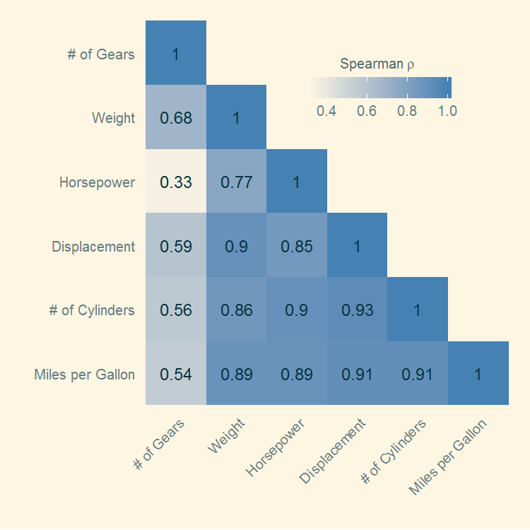
Back to the Blog-Index