Peter Haschke
Back to the Index
Biplot
I have been playing around with some of the data that I collected/coded for the dissertation project. I did some ol’ factor analysis and decided to create a bi-plot using ggplot. The plot turned out quite nicely. AND, it is always very satisfying if the data seem to make sense and confirm your expectations.
You can look at a higher quality copy of this image by clicking here: Biplot.pdf.
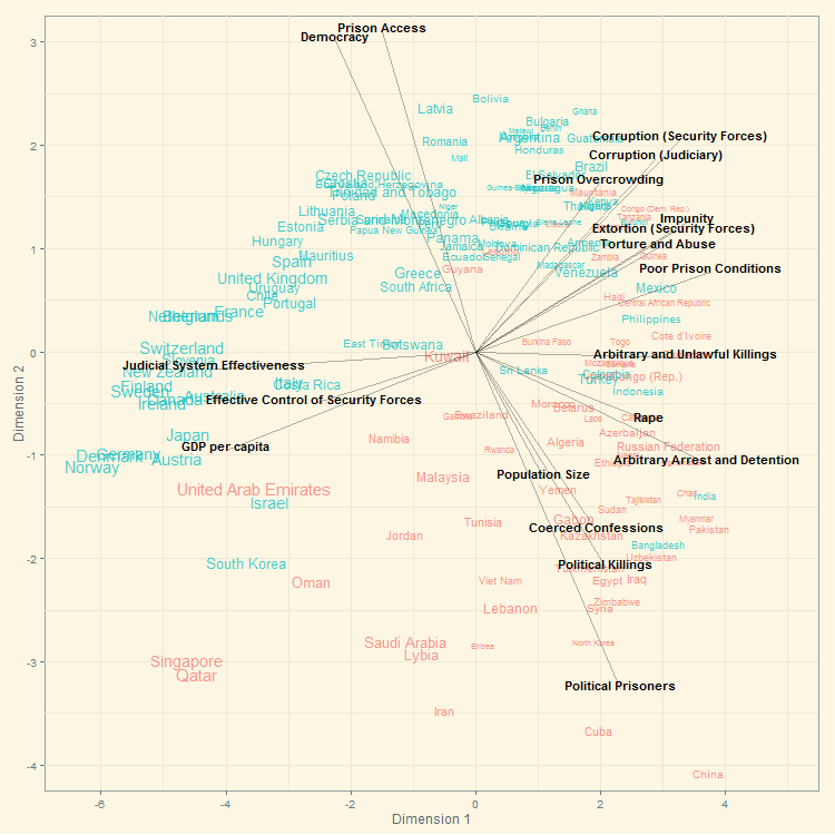
Legend: The figure is based on data I coded from the State Department’s annual human rights reports for 2005. Democracies are shown in blue (autocracies in red). Text size varies by GDP per capita (the larger the richer). Screeplot provided upon request only.
This post is filed under category Human Rights, and contains the following tags: R, ggplot2, Human Rights, Repression.Back to the Blog-Index